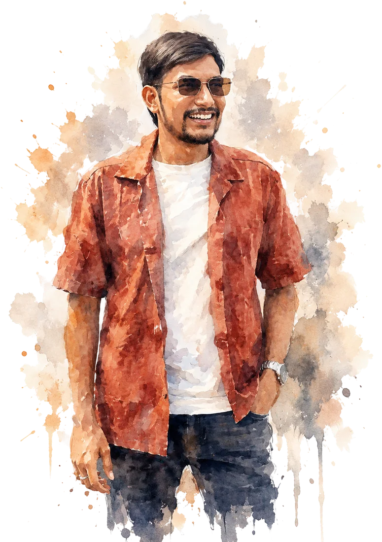
Ganesh Garuda — Product Designer & Design Engineer
I turn user research into interfaces people understand the first time — then build them myself, so nothing gets lost between the design and the code.
I design the product, then I build it myself.
Most of what I do is 0→1 internal software for hospitals, colleges and family-run groups in Andhra Pradesh. A medical college intranet and the products inside it. An MBBS logbook that replaces a paper book. A land and building register. A chairman's dashboard, a timetable system. Then the outward-facing half: college sites, a CRO site, a company site.
I design in Figma and build in React with Claude Code. The agent writes most of the code. I decide the structure, the design system and every state a screen can be in, and I read what comes back before it ships. That is why the mock and the live page look the same — one person, one set of tokens, no handover.
I care about the parts that usually get skipped: empty states, loading states, error messages, keyboard paths, the 14px versus 15px argument. This site is one more example. It is a working copy of the Figma canvas, shortcuts and all — press V, T, P or C and draw on it. Nothing is saved, which is half the fun.
Tools
Design
- Figma — Primary. Variables, auto layout, dev mode.
- Framer — Marketing pages, motion prototypes.
- Illustrator — Icon sets, logo cleanup.
- Spline — Light 3D for hero moments.
Agentic Build
- React + TypeScript — Daily driver.
- Next.js — App Router, RSC, route handlers.
- Tailwind CSS — v4, token-first.
- Framer Motion — Transitions, gesture UI.
- React Native + Expo — One shipped app.
Data & Infra
- Supabase — Auth, RLS, Postgres.
- PostgreSQL — Schema design, migrations.
- FastAPI — Python services for internal tools.
- Vercel — Preview-per-PR workflow.
Practice
- Design systems — Tokens → primitives → patterns.
- Prototyping — Coded prototypes over clickthroughs.
- Accessibility — Keyboard paths, contrast, focus order.
- Dev handoff — Designs ship in my own code.
Works
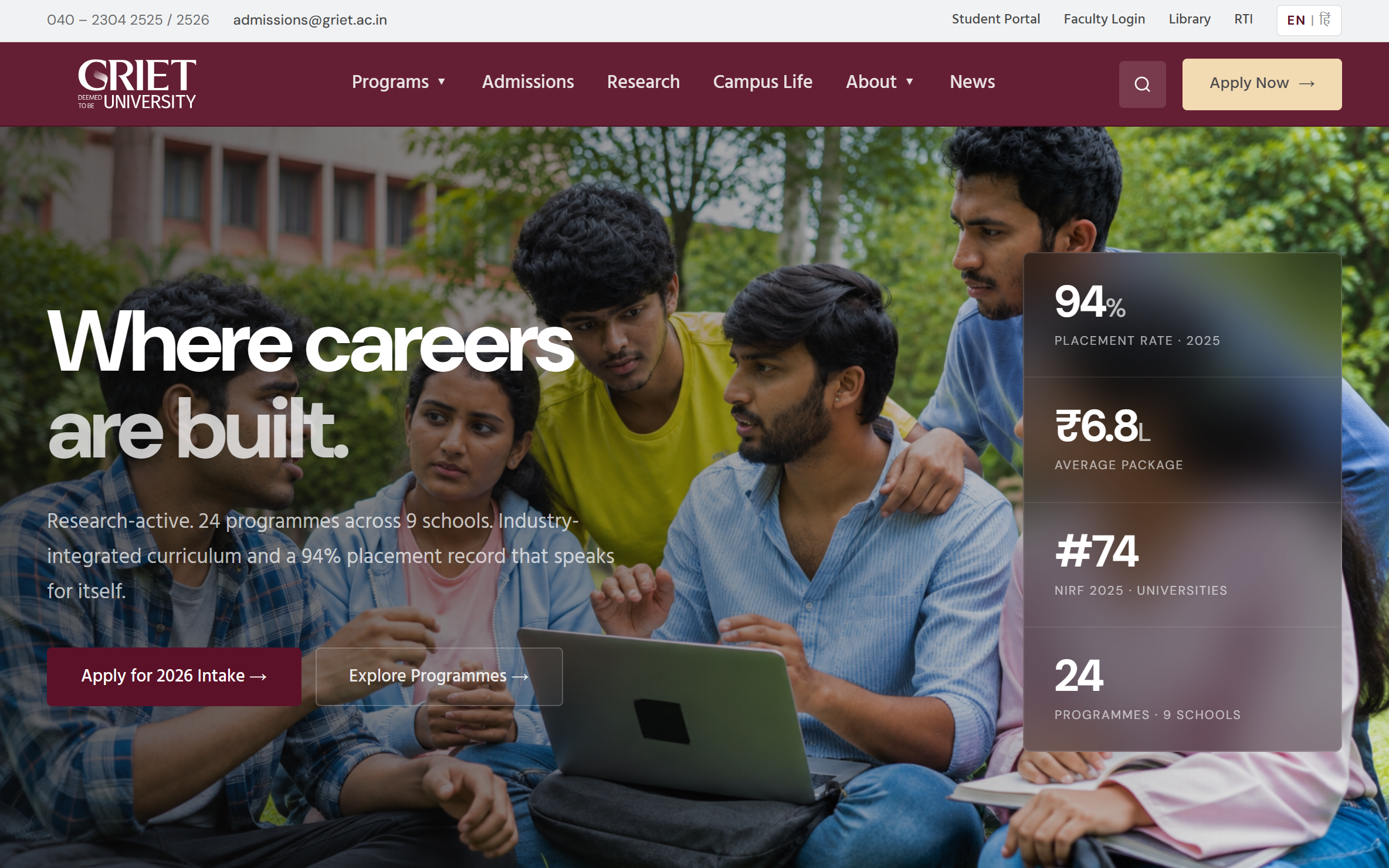
GRIET — University Website — GRIET, Hyderabad · in development, 2026
One university, two front doors. The main site has to be believed. The admissions page has to get the form filled.
A college homepage gets read by a 17-year-old and by the parent paying the fees, in the same sitting, with very different questions. On top of that, admissions runs campaigns that need a form and a deadline. That is a separate job, and a bad reason to redo the whole homepage.
- Put the five facts people check on the first screen: NAAC, NIRF, UGC, NBA and the placement rate. That row gets read before any paragraph does.
- Built it in React off one set of CSS variables, so the programme and news pages come off the same parts.
- Eleven sections you can read in one scroll, and an admissions page where the form needs no scrolling.
- Still in development. The photos are stock for now, and the numbers on the two pages are being checked with the college.
ASRAM UG Logbook — MBBS Competency Record — ASRAM College of Medicine, Eluru · in development, 2026
Every MBBS student keeps a logbook by hand, and every teacher signs it by hand. This is the same record, kept once, in a form the college can actually count.
The UG medical logbook is a paper book. The student writes the entry, carries the book to a faculty member, and waits for a signature. Nothing in that loop can be counted. Students cannot see how far they have reached in a subject. Faculty cannot see what is pending with them without opening every book. And the college cannot answer the question NMC actually asks: which competencies has this student been certified on, and by whom.
- Made the CBME syllabus the structure itself, not a dropdown on a form. 20 sections, 174 sub-sections and 2,602 competency codes ship as data, so an entry is filed against the syllabus instead of typed next to it.
- Built every screen from one design system. 46 shadcn components pointed at four tokens, so a table, a badge and a queue look the same in all 20 subjects instead of being redrawn for each panel.
- A student sees certified against required for every subject. A faculty member opens one queue with only their own pending items. And it still prints, because the copy the college keeps is a document.
- Still in development. It runs on an in-browser mock data layer for the demo, and the FastAPI and MongoDB backend behind it is written but not yet live for a batch.
ABC Group — Group Website — Diversified group · Andhra Pradesh & Telangana, 2026
Six businesses in six unrelated industries, on one homepage that has to make them look like one company.
Six businesses in six unrelated industries. Each one has its own audience, and wherever photos exist at all, its own look. The easy build is six panels that read as six companies stapled together. But one homepage has to answer a job seeker, a partner and a neighbour at the same time: who is this, and are they serious?
- Gave every industry the same block. Name, three lines, one drawing, same width, same height. Equal billing is the whole point of being a group. Ranking them by revenue would have finished that argument.
- Spent the only photograph on the only claim you can check: “3,000 students”, next to the campus it is talking about.
- Answered scale just below the fold instead of in the copy: 6+ industries, 1000s of employees, 2 states, as a stat row.
- One homepage carrying six industries without ranking them, and a visual language the inner pages can reuse.
- Careers reachable three ways: the nav, the hero, and a section of its own.
- Still in progress, not launched. The group video in the About block is a placeholder, and so is the brand on the page, till the real one is ready.
Orfus India — Company Website — Orfus India Pvt Ltd · Visakhapatnam, 2026
A software company site with no photo above the fold. The hero is four shader passes, drawn in the browser.
A fifteen-person startup with no product to show, no client logos to borrow and no photos worth publishing. The default is a stock hero of somebody else's office, which every visitor has already learnt to read as a company that has not built anything yet. The site also has one real job, hiring, and that cannot sit three clicks deep.
- Made the hero a full-screen shader instead of a picture. Nothing to art-direct, nothing that dates, and it draws itself at whatever size the screen is.
- Gave careers its own page, a nav slot, and an apply form that opens in place, so applying never takes you away from the role you were reading.
- Three pages from one set of components — home, careers, contact — and a hero that ships no image bytes at all.
- The apply form takes name, email, phone, years, a link and a resume. When the endpoint is not configured it says so in plain words instead of failing quietly.
- Not finished: the About photos are stock, and Login is a button with nothing behind it while the product it points at is being built.
Eastern Power Bill Payment — Self-initiated · unaffiliated redesign, 2026
An electricity bill payment app, redrawn around the one thing everybody opens it for.
Paying the current bill is a twelve-times-a-year job nobody does at leisure, and the app I was using turned it into a search. Onboarding was a wall of text with no pictures and no sense of progress. Sections ran into each other with no headings to scan. The payment path split into options before it even showed you how much you owed. I kept watching people around me, my own family included, give up and go stand in a queue instead. So I redrew it.
- Started from the job, not the app. Open it, see what is due, pay, keep the receipt. Anything that did not serve that path moved down the page or off it.
- Cut onboarding to two slides you can skip, one promise each, carried by an illustration. The original walkthrough was text nobody finished.
- Kept “Continue as Guest” on the sign-in screen. Account first was the obvious build, and the one that hands the utility a user record on install. I dropped it, because someone paying one bill a month on a shared phone quits at the signup form long before the payment screen. The account is offered after the first successful payment, once the app has earned the right to ask.
- Brought paying down to three steps: see the bill, confirm the amount, keep the receipt. Service number, period, units and amount all sit on the first card.
- Used a six-digit OTP instead of a password. A forgotten password on a shared phone ends up as a trip to the counter.
- Held the whole app to Poppins at four weights and one blue, on same-shape cards with big tap targets, so it reads at arm's length in daylight.
- Bill to receipt is three screens now, from a flow that used to split before it even started.
- Every section says what it is in a heading with a line of subtext, so the app can be scanned instead of studied.
- A first-time user can pay without making an account. That is the difference between the app being used once and never.
- This was my own redesign, done to prove the flow. The numbers here are design scope, not adoption.
Inlog — Visitor Management — Self-initiated · real estate & security tech, 2025
One visitor management app with three jobs inside it: the guard at the gate, the resident upstairs, and the admin who answers for both.
A gated apartment still runs its gate on a paper register and a phone call. The guard writes the visitor's name down and rings the flat. The resident either picks up or the visitor keeps waiting. The admin finds out days later, if that page is still readable. I spoke to all three sides and the same three complaints came back. 65% of security staff said manual entry is where the delays and mistakes come from. 80% of residents wanted to approve someone without taking a call. 70% of admins wanted a way to reach every flat at once in an emergency. One app, three jobs, and the reason nobody had built it is that the three jobs want different screens.
- Wrote the three roles as real people first: a duty guard, a working resident, and a committee admin looking after 2,000 flats. What frustrates each of them decided what their dashboard opens on.
- Made the role the first question the app asks. After that it is three different apps inside one shell, so no screen carries buttons two-thirds of its users cannot use.
- Treated an entry as a request that travels. The guard raises it, the resident approves or rejects it from anywhere, and the log keeps who decided and when. No call, no callback, no argument later.
- Kept a one-time visitor out of the account system completely. They fill in the purpose at the gate and get a QR pass, and the flat is notified before they put the phone down.
- Gave the log something worth believing: CCTV snapshots stamped with the camera and the time, sitting next to the entry they belong to.
- Held the whole app to Satoshi at four weights, one burnt orange, and a warm neutral background. It is read at a gate in bright daylight and on a phone at a desk, so contrast does the work, not colour.
- Three role-wise dashboards out of one component set. The shell, the cards and the approval row are the same pieces everywhere.
- A visitor's full path is designed end to end: gate form, resident approval, QR pass, then a logged entry with camera proof.
- 14 screens, including every state of the approval loop, so the build had nothing left to invent.
- This is a concept product, not a shipped one. The percentages above are what the design is aiming at, not adoption numbers.
Contact
Read this portfolio as a plain scrolling page